

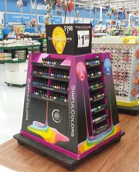

Most POP displays are designed for full, balanced product loads. But that’s not how they perform in-store. Within days: One SKU sells faster than another
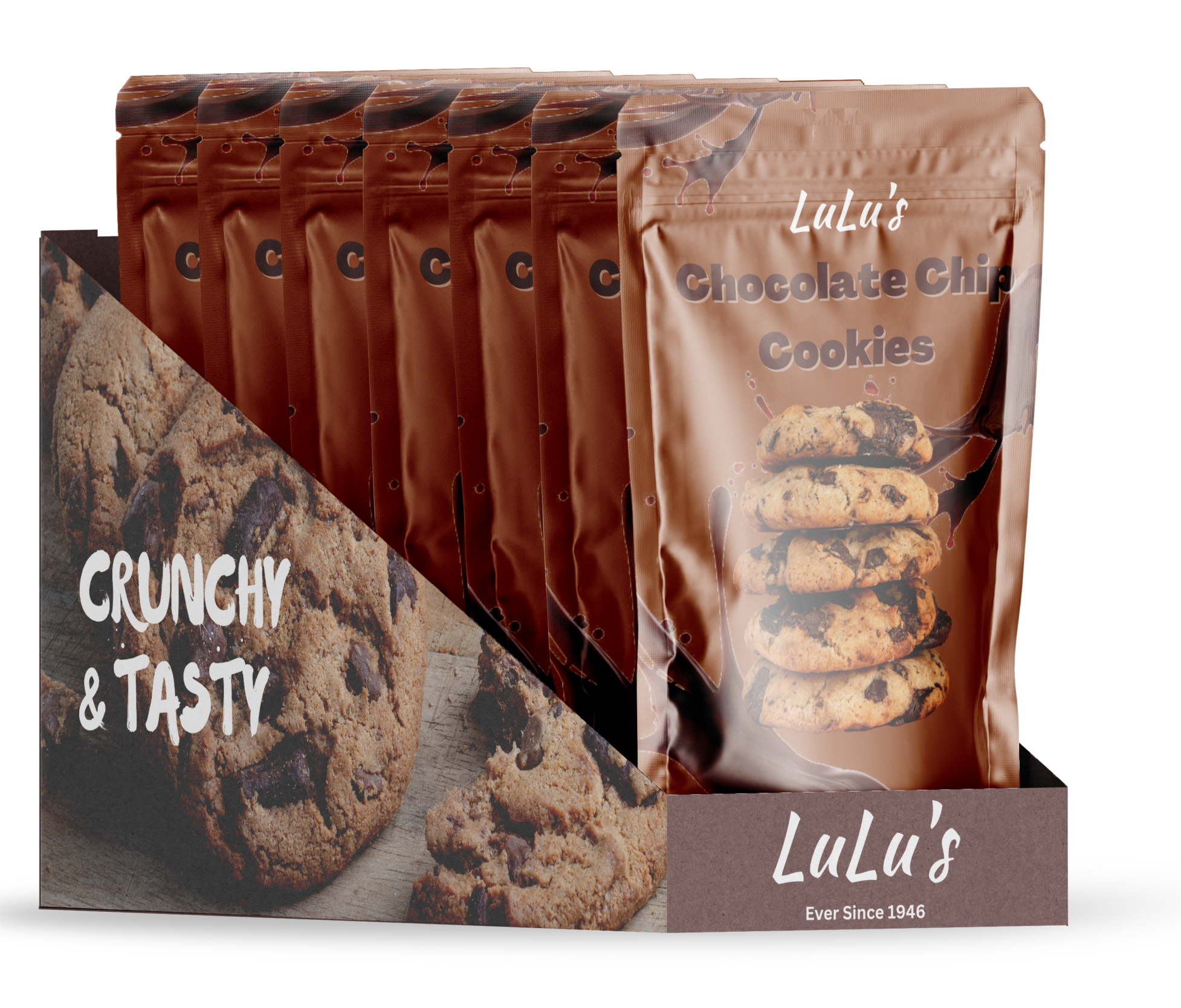
Display
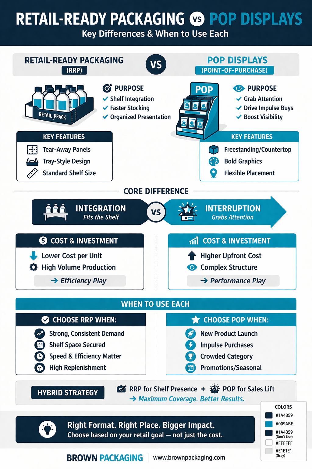
Retail-ready packaging (RRP) and POP displays are often treated as interchangeable. On paper, they both improve product presentation and efficiency. In reality, they serve completely
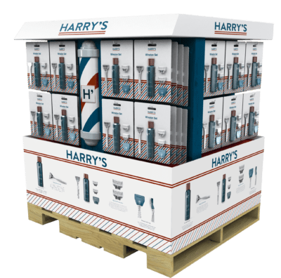
Display
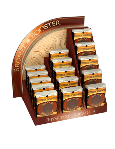
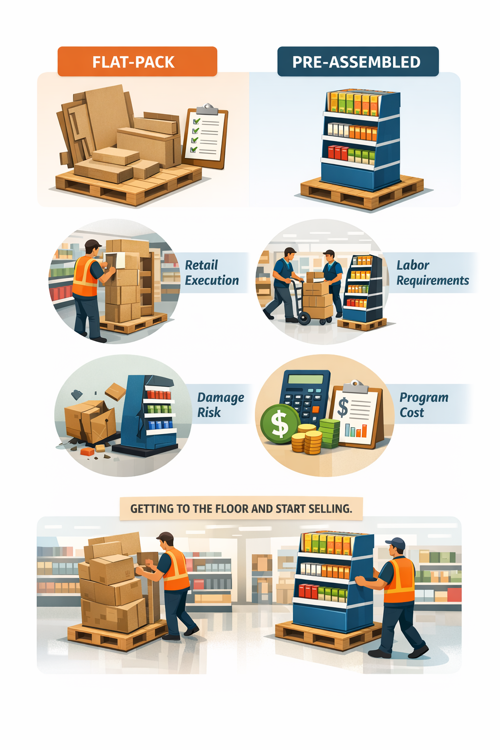
There’s no universal “better” option—but there is a better fit depending on your program. Brands often default to flat-pack to save on freight or pre-assembled