

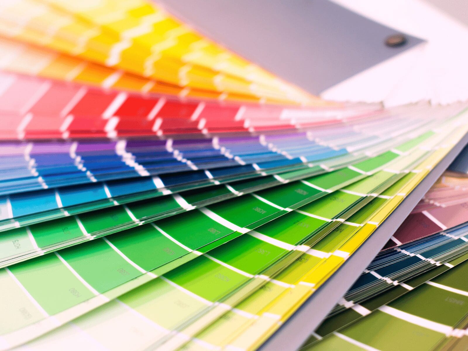

Design
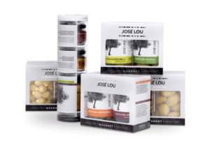
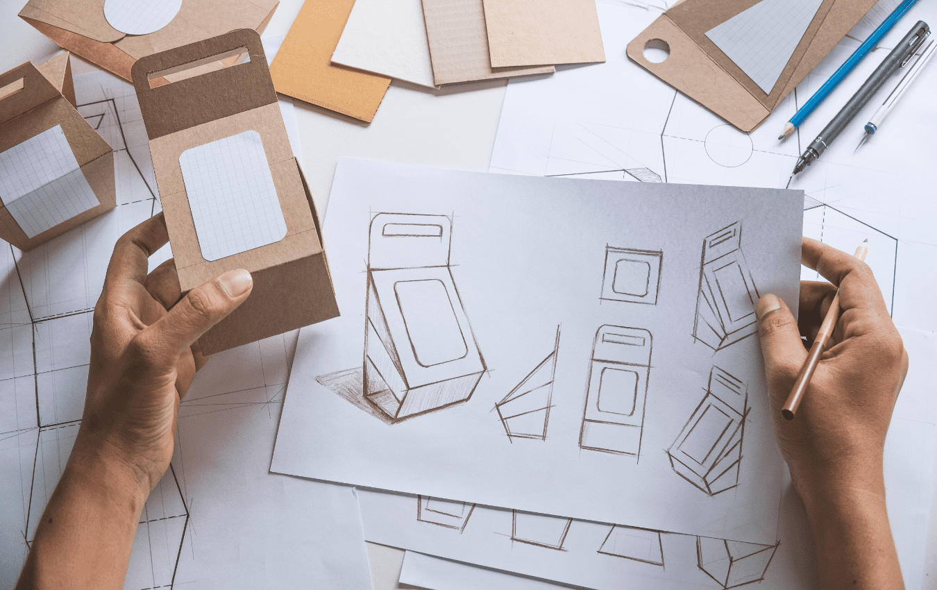
Taking your packaging’s design from concept to completion can seem rather complex and challenging for those that are new to the packaging design process. Everyone
Design
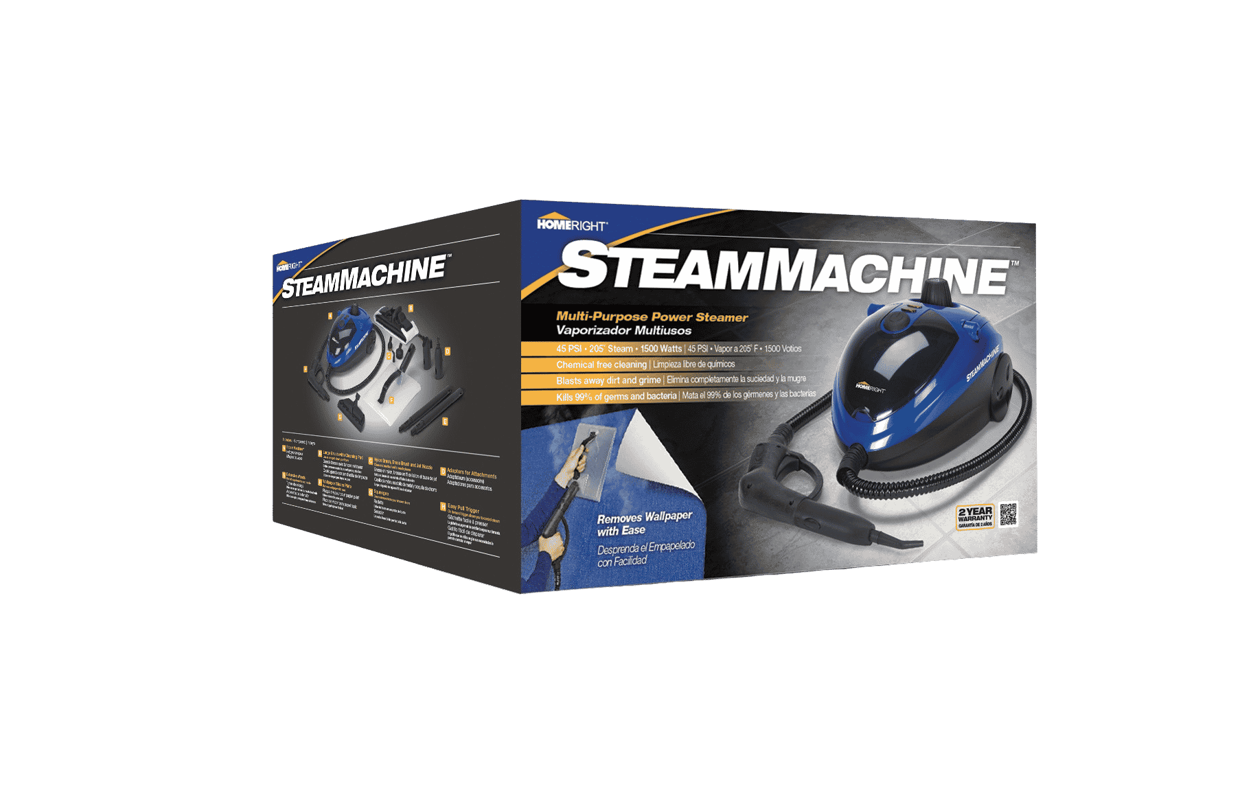
High-speed automated packaging lines can run hundreds of cartons per minute, but only if the carton’s design and material are optimized for smooth feeding, folding,
Design
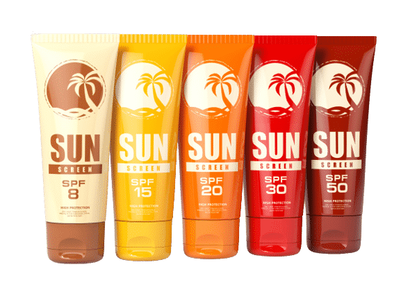
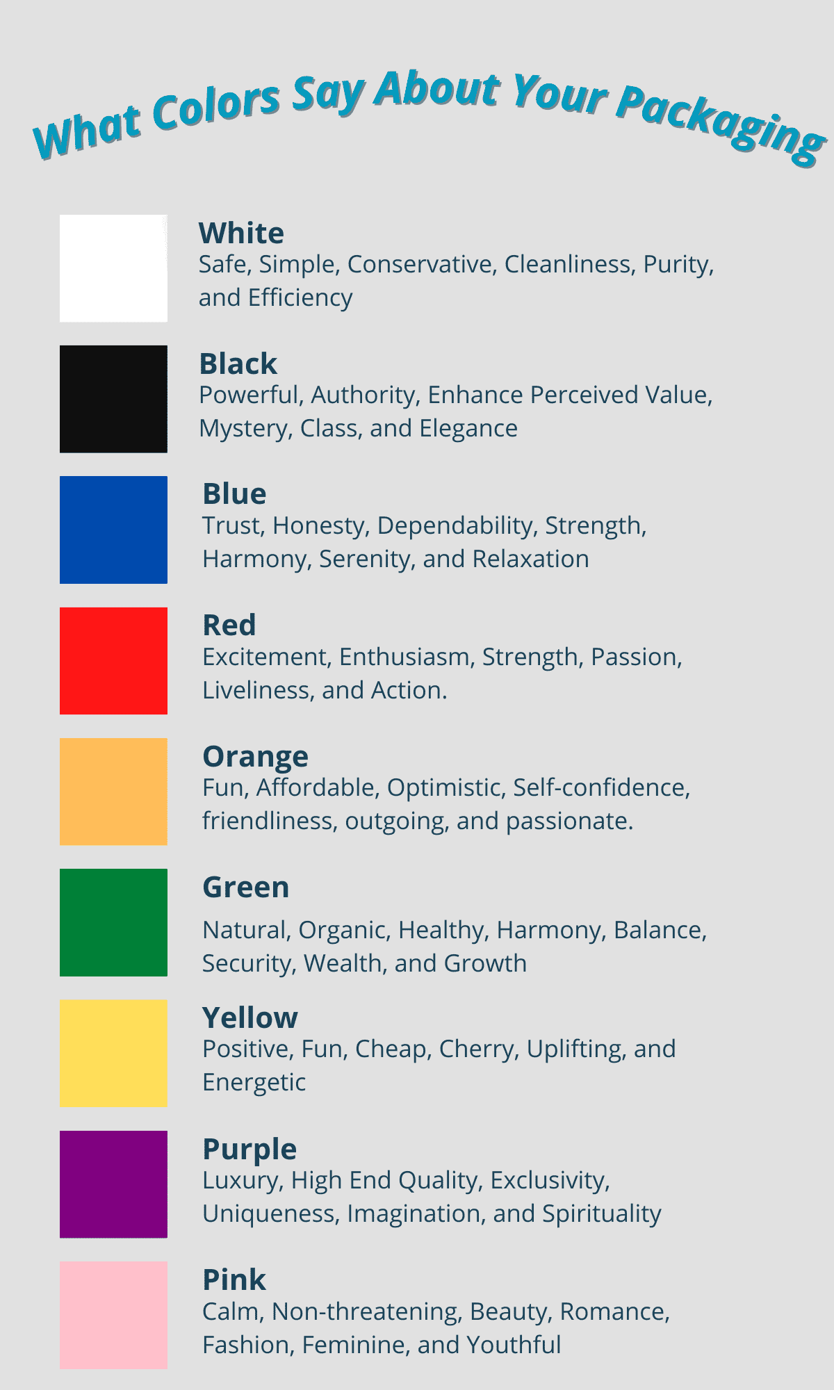
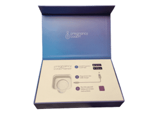
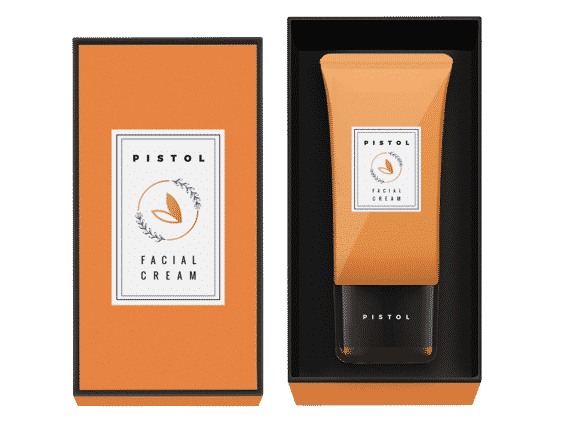
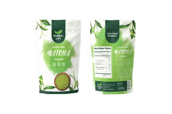
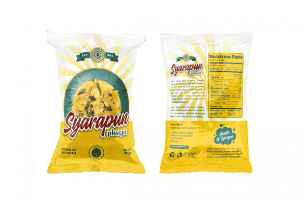
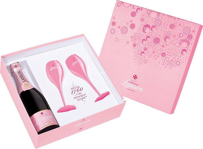
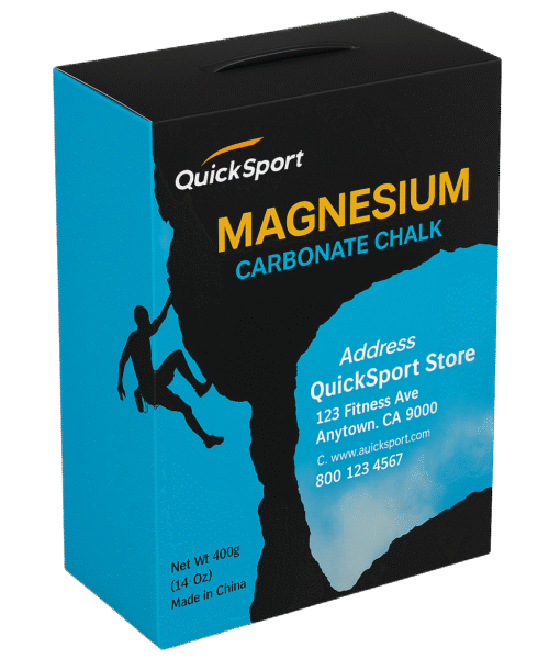
When most buyers think of packaging design, they picture logos, colors, and graphics—but what’s often overlooked is structural design: the way your box is shaped,