Home » Optimizing the Size and Structure of Your POP Displays
Optimizing the Size and Structure of Your POP Displays

When it comes to retail marketing, Point of Purchase (POP) displays are essential for capturing customer attention and promoting your products effectively. The size and structure of these displays play a critical role in their success, influencing both visibility and shopper engagement. This blog explores how to optimize the size and structure of POP displays to maximize their impact in a retail setting.
Understanding the Importance of Size and Structure
The size and structure of a POP display can dramatically affect how a product is perceived by shoppers. Too large, and the display can overwhelm the product or clutter the shopping environment; too small, and it risks being overlooked. The right balance ensures the display is engaging without being obtrusive, and that it fits well within the available retail space.
Key Considerations for Optimizing Size
Retail Space Constraints
Before designing a POP display, it’s crucial to consider the available space. In a crowded retail environment, a compact, well-organized display might be more effective. Conversely, in larger, more open spaces, a bigger display could be used to make a bolder statement.
Product Type and Size
The size of the display should correspond to the size and type of the product. Larger items might need sturdier and more spacious displays, while smaller items can benefit from more petite, densely packed displays that allow for easy browsing.
Visibility and Reach
Ensure that the display is not only visible from a distance but also easily accessible to all customers, including those with disabilities. The height of the display should allow children and adults to comfortably interact with the products, ideally without having to reach too high or bend too low.

Strategies for Structuring Your Display
Modular Design
Modular POP displays offer flexibility as they can be easily adjusted or reconfigured to accommodate different products or to fit different spaces. This adaptability makes them ideal for retailers who frequently change their promotions or product placements.
Durable Materials
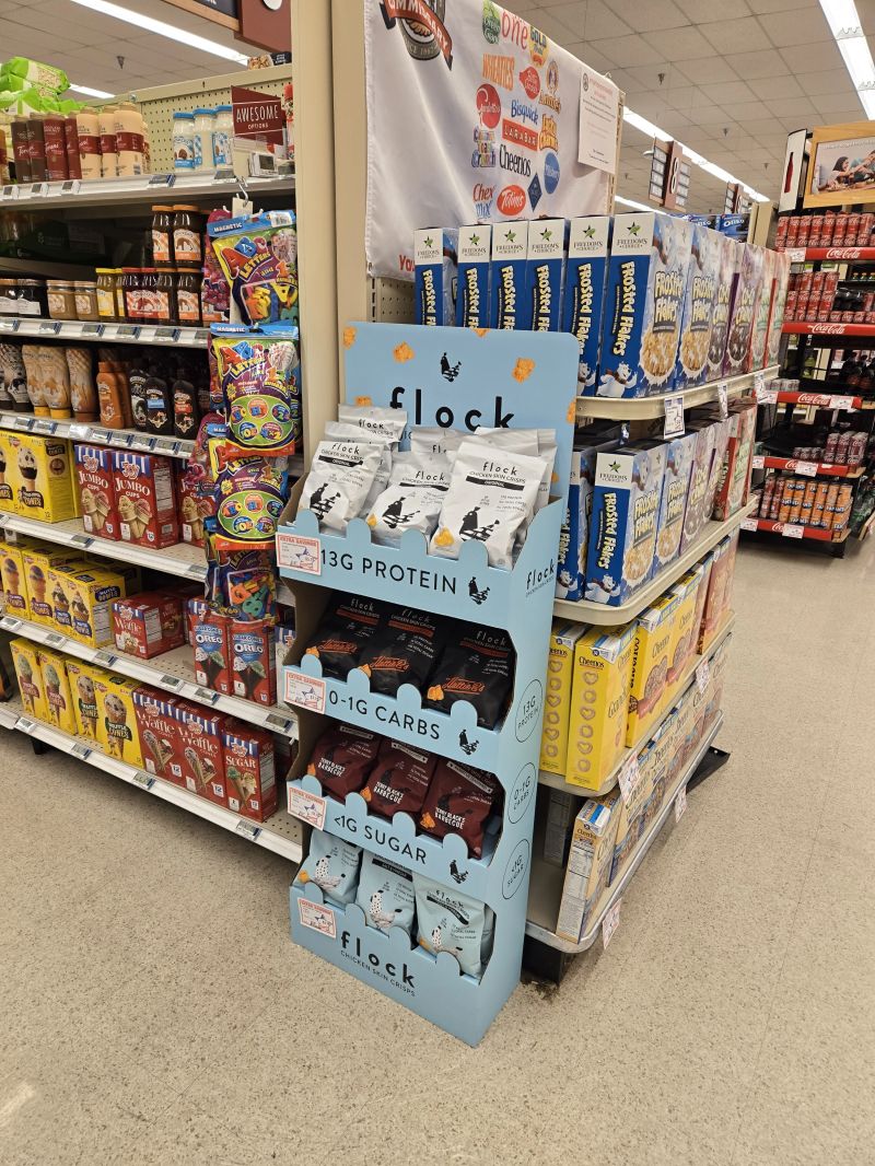
The choice of material can affect both the appearance and durability of a POP display. Materials should be chosen not only for their aesthetic appeal but also for their ability to withstand regular interaction from customers. Metal or high-grade plastic structures can offer longevity, while cardboard might be suitable for shorter, seasonal campaigns.
Interactive Elements
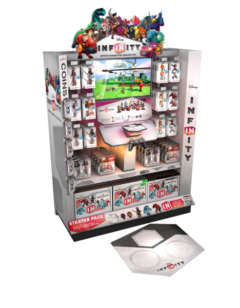
Incorporating interactive elements such as digital screens, touch panels, or movable parts can make a display more engaging. These features can help draw in customers and provide them with a memorable shopping experience.
Use of Levels and Depth
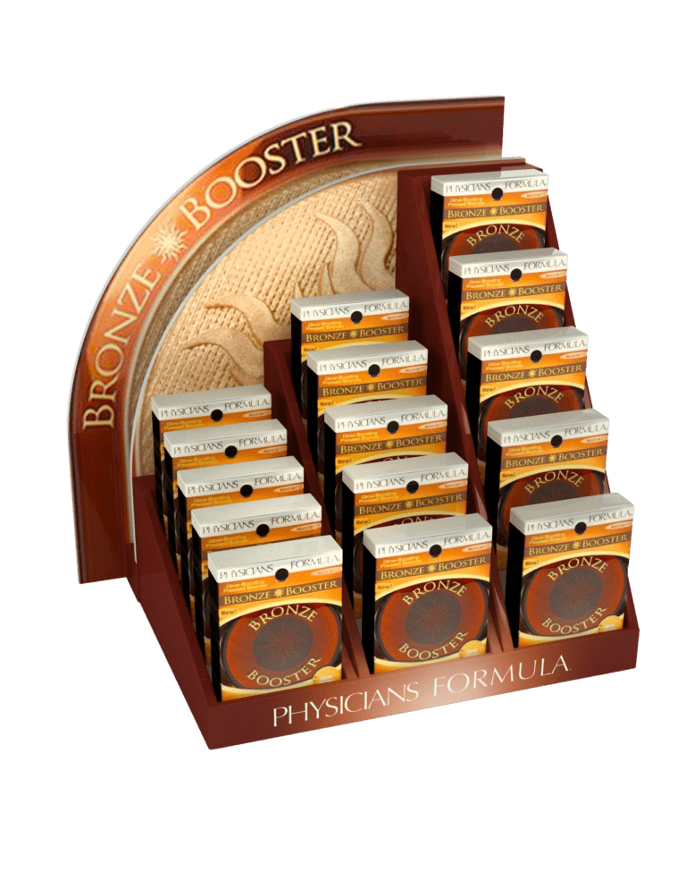
Creating levels and depth within a display can guide the shopper’s eye and highlight different products effectively. Elevated platforms or staggered shelving can help make each product stand out while ensuring that none are hidden from view.
Balancing Aesthetics and Functionality
While the structure should be visually appealing, it must also be functional. The design should facilitate an easy flow of traffic around the display and allow customers to interact with the products without any barriers. Careful consideration of the layout and overall design can prevent the display from becoming too complicated or confusing to navigate.
If you are interested in POP displays, then partner with Brown Packaging today to get started.
A POP display isn’t successful when it looks good leaving production—it’s successful when it arrives intact, gets placed correctly, and performs in-store. The problem is
Print is one of the biggest cost drivers in POP displays—and one of the most misunderstood. Most decisions are made based on how it looks,
There’s no universal “better” option—but there is a better fit depending on your program. Brands often default to flat-pack to save on freight or pre-assembled
Most packaging cost discussions focus on unit price. Very few quantify the financial impact of obsolete inventory. Yet for many brands and industrial programs, packaging
Most brands invest in POP displays without clearly measuring performance. They look at sales after rollout and assume the display worked—or didn’t. But without isolating
Most cost-cutting in POP displays happens in the wrong place. Brands reduce board grade, simplify structure too aggressively, or cut print quality—only to see: Higher
Home » Optimizing the Size and Structure of Your POP Displays

Cross-merchandising is one of the most effective ways to increase basket size in retail. By pairing complementary products in a single point-of-purchase (POP) display, brands

As the 2025 holiday season approaches, retailers are gearing up for what promises to be another bustling period of consumer activity. For brands looking to

For retail brands, Point of Purchase (POP) displays are crucial for maximizing product visibility and driving sales. Ensuring that these displays are retail-ready is key


