


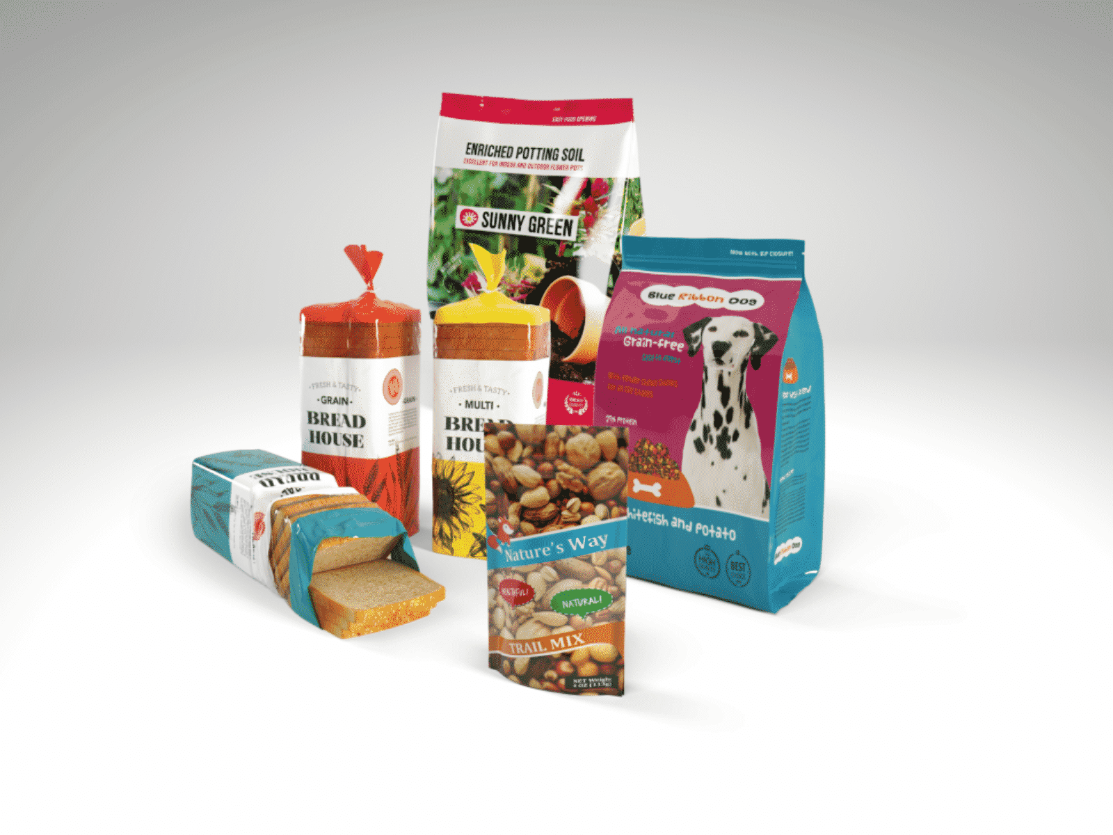
Flexible Packaging
The food industry has undergone a variety of changes over the years, with one of the most prominent shifts being in the area of packaging.
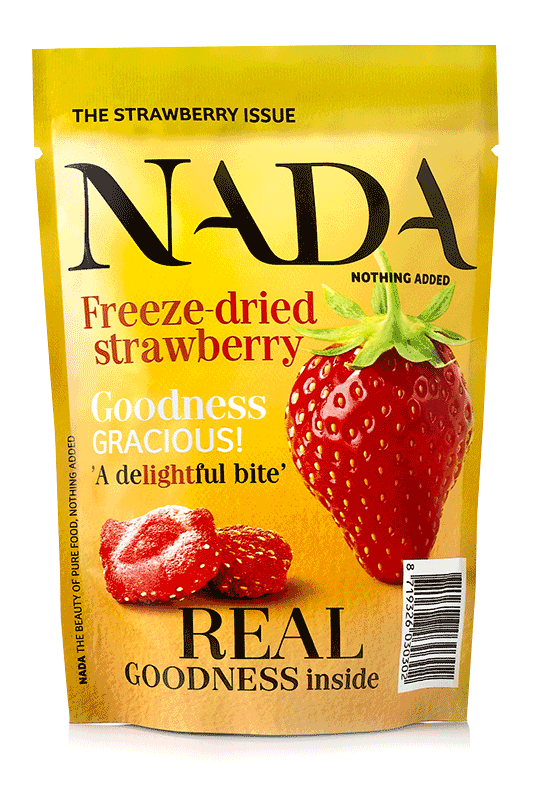
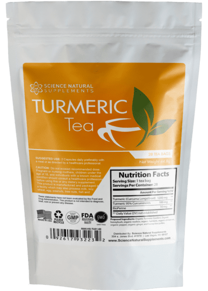
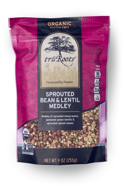
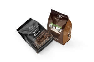
Pouch
Pouch packaging has gained immense popularity across various industries due to its convenience, versatility, and eye-catching design possibilities. However, when considering pouch packaging for your

Flexible Packaging
Poly bags, known for their versatility and cost-effectiveness, are widely used in various industries for packaging. However, their durability can sometimes be a concern, especially