Home » Simplicity Sells: How Minimalist Packaging is Revolutionizing Product Design
Simplicity Sells: How Minimalist Packaging is Revolutionizing Product Design
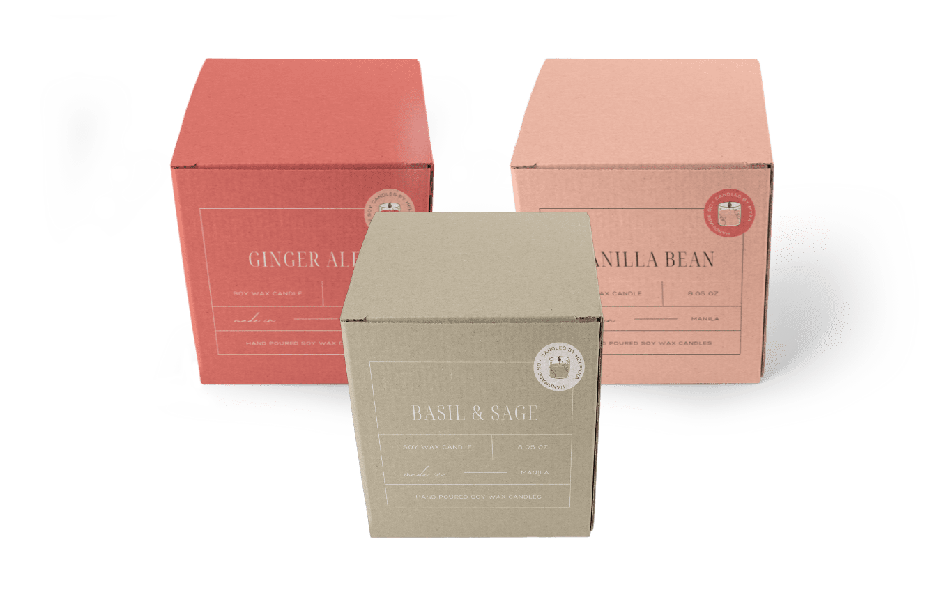
Minimalist packaging is a design trend that has taken the packaging industry by storm in recent years. The concept of minimalism is centered around the idea of “less is more,” and it has become a popular approach in many aspects of design, including packaging. Minimalist packaging is all about using simple, understated design elements to create a distinct visual identity that stands out on the shelves.
The Appeal of Minimalist Packaging
Minimalist packaging is characterized by its simplicity and understated design. It is a design approach that involves removing all unnecessary elements, such as excessive text or graphics, to create a clean and visually appealing packaging. This design trend has become increasingly popular in recent years, as more and more brands recognize its appeal. In this section, we will discuss the different aspects of minimalist packaging that make it so appealing to consumers and brands alike.
Clarity and Simplicity
Minimalist packaging is appealing because it is clear and simple. It is easy to understand, and consumers do not have to spend time trying to decipher the meaning of complex designs or graphics. With minimal packaging, the product is the star of the show, and the packaging does not overshadow or detract from it. This approach makes it easier for consumers to identify the product they want, and they are more likely to remember the brand because it is easy to recognize.
Aesthetic Appeal
Minimalist packaging is also visually appealing. The use of clean lines and simple colors creates a sleek and modern look that is visually striking. Minimalist designs have an elegance and sophistication that appeals to today’s consumers, who are looking for products that are both functional and aesthetically pleasing. The simplicity of the design can also create a feeling of luxury and exclusivity that consumers find attractive.
Brand Differentiation
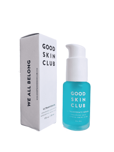
Minimalist packaging is a powerful tool for brand differentiation. With so many products competing for consumer attention, it is essential for brands to stand out. By using minimal packaging, brands can create a distinct visual identity that sets them apart from their competitors. This is especially important in industries such as cosmetics, where products are often similar, and packaging plays a critical role in differentiating brands from one another.
Environmental Responsibility
Another aspect of the appeal of minimalist packaging is its environmental responsibility. Minimalist packaging uses fewer materials, and the materials used are often recyclable or biodegradable. This approach to packaging design is more sustainable, and it appeals to today’s environmentally conscious consumers. Brands that embrace minimalist packaging are positioning themselves as responsible and eco-friendly, which can be a significant selling point in today’s market.
How Brands are Using Minimalism to Stand out
Minimalist packaging is a powerful tool for brands looking to stand out on shelves. By simplifying their packaging design, brands can create a distinct visual identity that is memorable and eye-catching. In this section, we will discuss how brands are using minimalism to differentiate themselves from their competitors.
Bold Typography
One way that brands are using minimalism to stand out is through bold typography. By using simple, bold typefaces, brands can create a clear and memorable message that is easy to read and identify. Bold typography can also add a sense of personality to the brand, making it more relatable and appealing to consumers.
Negative Space
Another design element that is commonly used in minimalist packaging is negative space. By leaving large areas of blank space around the product, brands can create a sense of sophistication and elegance. Negative space also allows the product to stand out on the shelves, drawing the consumer’s eye and making it easier to identify.
Minimal Graphics
Brands are also using minimal graphics to make their products stand out. Rather than using complex designs, they are using simple, minimalist graphics that emphasize the product’s key features. This approach allows the product to speak for itself, while the packaging design adds a touch of elegance and sophistication.
Color Palette
Minimalist packaging often uses a limited color palette to create a simple, cohesive look. Brands are using this approach to create a strong visual identity that is easily recognizable. By using a limited number of colors, brands can make their packaging stand out on the shelves, making it easier for consumers to identify their products.
Summary: Minimalist Packaging
In conclusion, the trend towards minimalist packaging is a response to the changing preferences of today’s consumers. In a world where we are bombarded with an overwhelming amount of information and visual stimuli, minimalism offers a refreshing and straightforward approach to packaging design. It is a design philosophy that prioritizes clarity, simplicity, and functionality, and it is resonating with today’s consumers who are looking for products that are easy to use, understand, and identify.
Minimalist packaging offers many benefits to brands, including the ability to differentiate themselves from their competitors, create a distinct visual identity, and appeal to environmentally conscious consumers. By using bold typography, negative space, minimal graphics, a limited color palette, and sustainable materials, brands can create packaging that is both visually appealing and responsible.
As the trend towards minimalist packaging continues to grow, we can expect to see more brands embracing this design philosophy. By adopting a minimalist approach to packaging design, brands can create a competitive advantage in a crowded marketplace, appeal to consumers’ changing preferences, and demonstrate their commitment to sustainability. With its clean lines, understated design, and emphasis on functionality, minimalist packaging is poised to become the dominant design trend for years to come.
If you are interested in custom packaging and/or minimalistic packaging design, then contact Brown Packaging today to get started.
Not all retail environments are the same—and your POP display shouldn’t be either. What works in big box retail often fails in specialty stores, and
Bigger doesn’t always mean better. Many brands default to floor displays because they assume more visibility equals more sales. But in many retail environments, counter
Retail-ready packaging (RRP) and POP displays are often treated as interchangeable. On paper, they both improve product presentation and efficiency. In reality, they serve completely
Companies managing multiple SKUs often face the challenge of balancing protection, efficiency, and cost in their packaging systems. Custom inserts can be designed with modularity
Many packaging programs grow bloated over time, with dozens of overlapping box sizes, materials, and formats. While this may seem flexible, it often increases costs,
The conversation around affordability has changed. Brands aren’t just trying to spend less — they’re trying to spend smarter while maintaining the same level of
Home » Simplicity Sells: How Minimalist Packaging is Revolutionizing Product Design
In today’s market, the printing strategy employed on packaging can play a significant role in a product’s success. This guide is tailored to help buyers
Before committing to a full production run, businesses often receive packaging samples to evaluate fit, functionality, print quality, and overall design. Whether it’s a digital

There are many factors that can contribute to the cost of packaging with freight being no exception. Freight is the process of transporting your product


